

Essex Cricket
The first stage of rebranding Essex Cricket and forging a new identity for the club was developed with several important topics in mind. These included a complete review and audit of the Essex brand, together with analysis, of in-depth research, both historical (ancestral connections heritage and influence) and in relation with the modern game of cricket as well as current audience participation and trends and the increasing influence of the shorter game of white ball cricket.
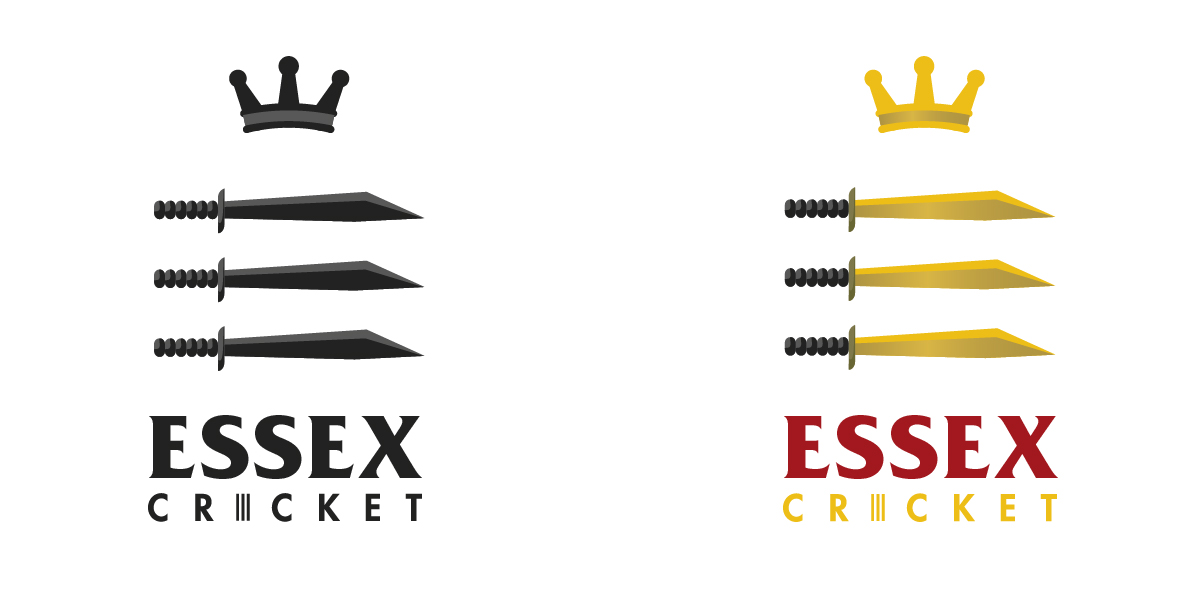
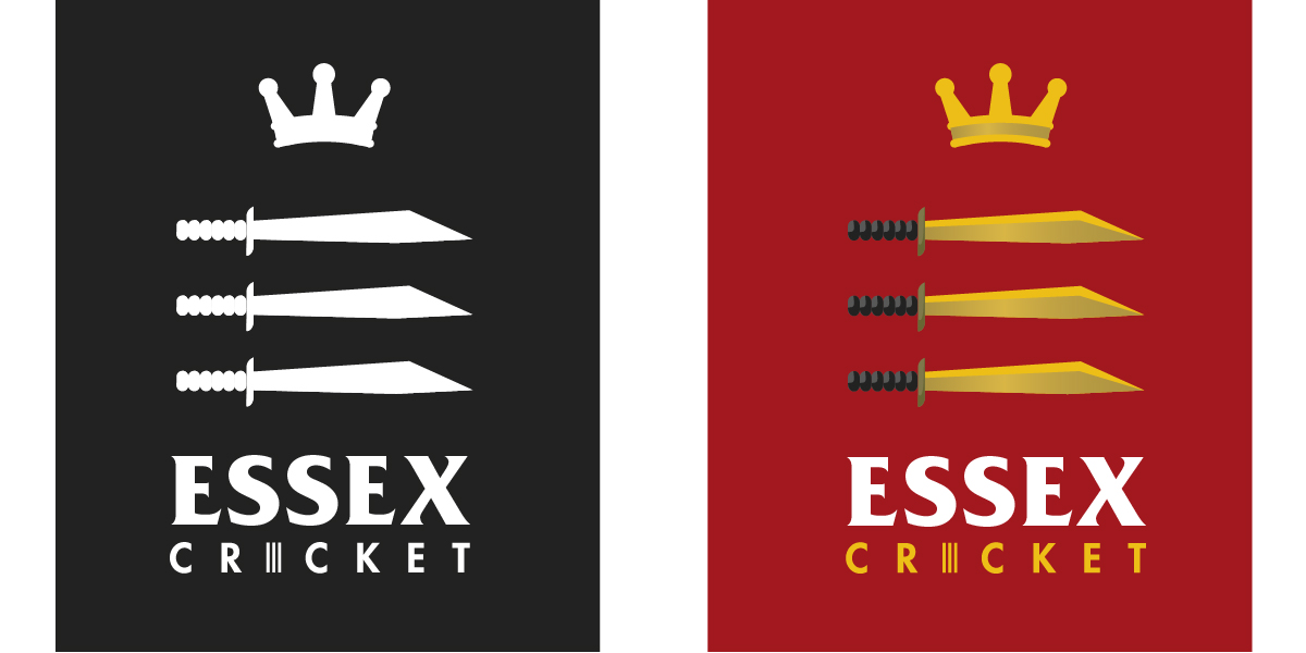
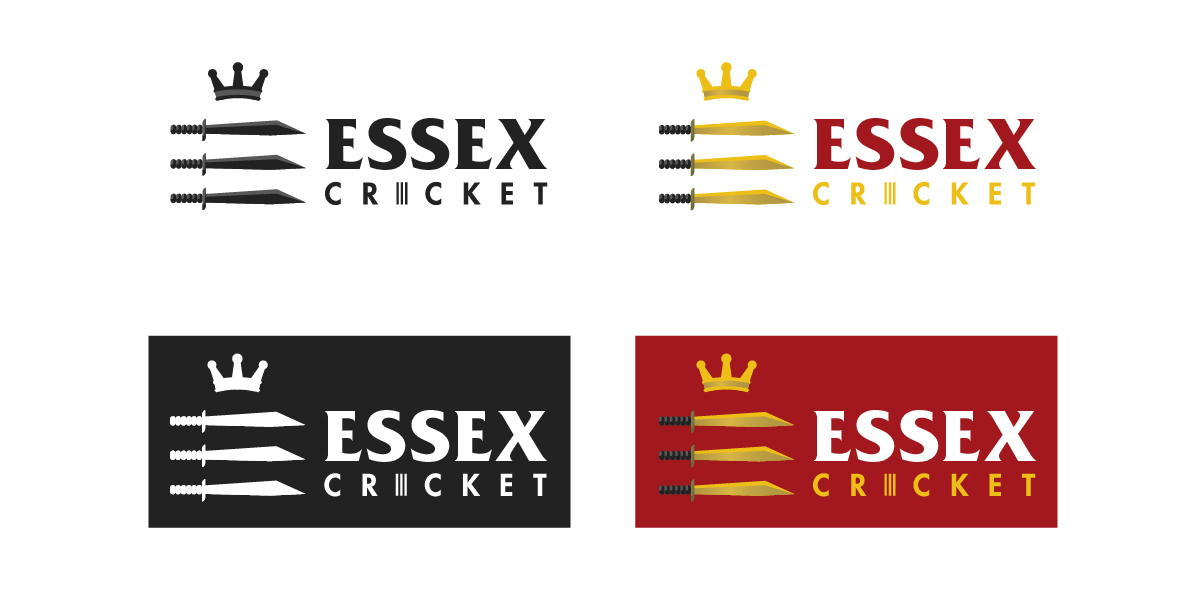
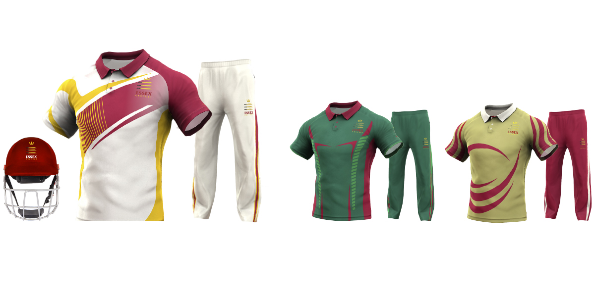
Visually speaking a concerted effort was made to give the club a clear identity of its own allowing the design as a whole to be free from associations with old Essex Regiment of Napoleonic wars and the constraints of Essex County Council. In particular, the Saxon short sword depicted in the new signature is now more historically accurate rather than the romanticised scimitars associated with heraldry which many County Councils use in their crests. This was also reflected in the new Essex Cricket colour palette.